Movie posters are films in themselves, telling us the story of a film even before we enter the theater. Like movies, these visual masterpieces have taken a fascinating journey through time, evolving immensely over the years. And their development isn’t only related to techniques used to promote cinematic pieces. Their purpose goes way beyond that, entailing a narrative of how artistic expression and storytelling have interwoven to captivate and inspire us for more than a century.
Let us walk you through the unique movie poster art eras and their contributions to the cinematic world.
Hand-Painted Masterpieces (1900s-1940s)
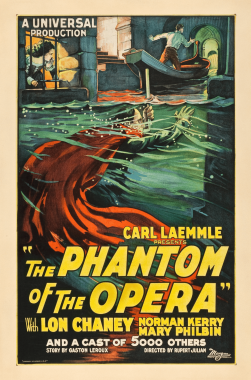
During the early 20th century, the world of cinema was blooming, and so were movie posters. Hand-painted works of art weren’t as massive as they are today, but they caused many people to gather around and be amazed by the manual techniques used to create such pieces. At that time, posters served as persuasive advertisements, driving many people to the cinema. Skilled artists brought their brushstrokes to life on large canvases, creating breathtaking visuals displayed outside movie theaters. These classic posters were genuine masterpieces, showcasing vibrant colors and intricate details that left lasting impressions.
Illustrators like Morgan Litho and Jules Cheret were among those who contributed to this art. Their work involved creating compelling visuals that could capture the essence of a film, all within the confines of a poster. The success of posters made film directors hire renowned artists to design appealing visuals for them. The demand for those people was immense, making them travel between countries non-stop. Luckily, anyone can now come up with an outstanding advertisement. A poster maker by Vista Create equips you with tools to design beautiful visuals for any purpose, whether movie promotion, event description, or party invitation.
Photographic Elegance (1950s-1970s)
The mid-20th century marked a significant shift in movie poster design. It was the era of photographic elegance, where the art of cinema embraced the power of photography to capture and entice audiences. Movie studios started to feature photographic images of the film’s stars, creating a sense of intrigue. Such pieces often showcased the glamor and charisma of the lead actors, drawing viewers into the world of the movie.
This era was not just about promoting films. It was about creating visual experiences. The posters became an integral part of cinema culture, and audiences eagerly anticipated the release of new visuals as much as they did the films.
Digital Revolution (1980s-2000s)
This period led to a significant shift from traditional, handcrafted methods to modern, computer-generated designs. The tech revolution transformed how posters were created. Designers could now experiment more freely, combining typography and graphics innovatively. The poster for “Trainspotting” (1996) is a prime example, incorporating bold typography and gripping visual elements to convey the film’s edgy and provocative nature.
A fusion of artistic flair and tech progress characterized this era. Digital tools gave creators a broader palette for their imagination, letting them produce unusual visuals that captured the movie’s essence in a way that was impossible before.
Contemporary Artistry and Trends
Today’s posters have become a playground for modern creativity, offering quirky designs that speak to a broad spectrum of consumers. The contemporary industry breaks down poster designs into three types:
- Minimalist marvels often focus on a single icon image or symbol that encapsulates the film’s essence. These designs leave space for viewers’ imagination, drawing them in through simplicity.
- Character-centric designs zoom in on the cast and emphasize the individual characters and their nuances.
- Alternative interpretations provide fresh perspectives on films, highlighting facets that may not be emphasized in the official marketing.
This contemporary realm showcases the evolving nature of posters, expanding to something more than marketing.
Enduring Poster Icons
Many legendary posters exist, each with characteristics, unique features, and designs. Let’s explore just a few of these iconic pieces:
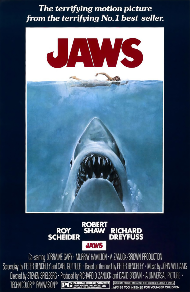
- Jaws (1975): The famous “Jaws” poster, with a menacing shark lurking beneath a swimming woman, is a prime example of how a poster can become an enduring symbol. Besides intrigue, this piece evoked fear, making it one of cinematic history’s most recognized parodied images.
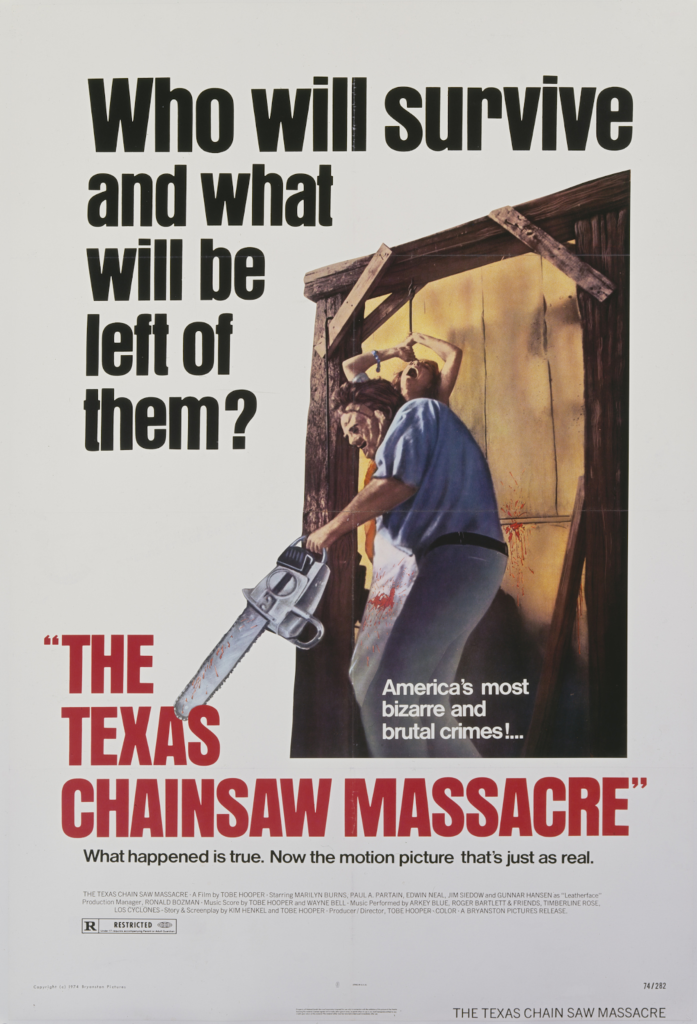
- The Texas Chainsaw Massacre (1974): The poster for this horror film is minimalistic and haunting. It features a striking close-up of Leatherface, the menacing antagonist, with his chainsaw revving. The use of negative space and stark colors creates an eerie and unsettling atmosphere, setting the tone for the relentless terror awaiting viewers.
- Parasite (2019): The poster for Bong Joon-ho’s masterpiece mirrors the film’s social commentary. It features a visually arresting image of the two hoes central to the story, one above ground and one below. The stark contrast between the two residences encapsulates the themes of class division, making it thought-provoking.
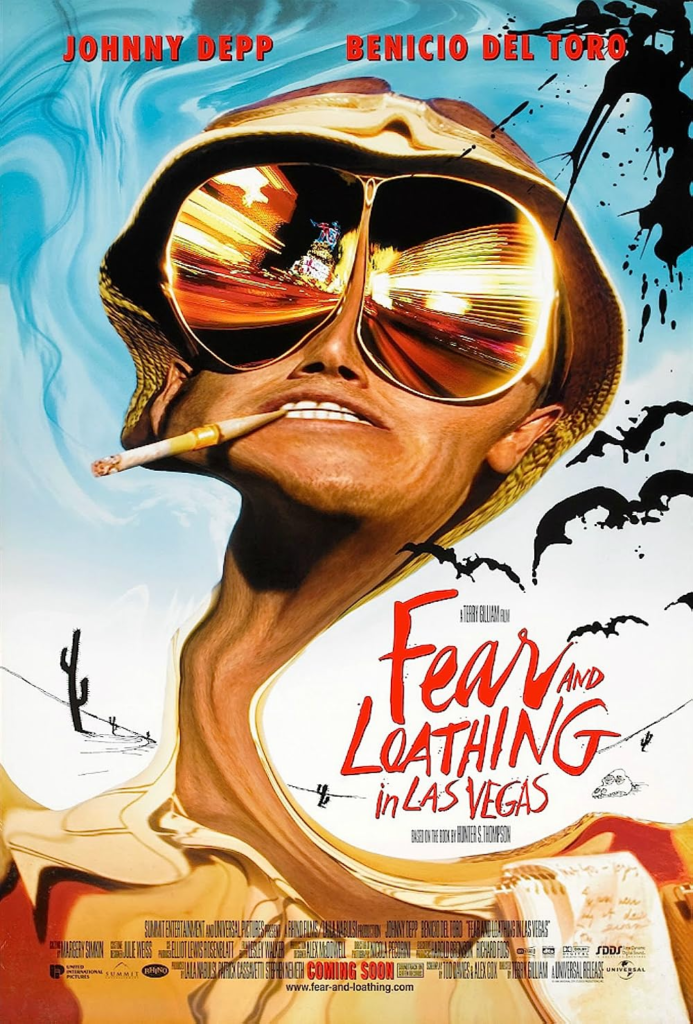
- Fear and Loathing in Las Vegas (1998): Adapted from Hunter S. Thompson’s novel, the poster for this film is as hallucinatory as the story it tells. It presents Johnny Depp and Benicio del Toro in their drug-induced alter egos, surrounded by a chaotic swirl of images and colors. This poster captures the film’s psychedelic and surreal journey.
A Picture’s Worth a Thousand Words
The evolution of movie posters reflects the broader changes in art, technology, and storytelling. Such pieces have transcended their marketing role to become symbols in their own right, representing their counterparts’ fear, elegance, and allure. Although their purposes changed over time, we can still appreciate their visual appeal and remind ourselves that the cinematic world is ever-changing.
