


Areas We Cover
Categories

HOW SET DESIGN USES COLOR TO SHAPE THE AUDIENCE’S EMOTIONS
by Lamont Washington | July 6, 2026
in Extras
Color is one of the first things an audience notices, even when they are not consciously thinking about it. Before an actor speaks or a plot unfolds, the colors surrounding a scene begin influencing expectations. A warm palette may suggest comfort, while darker tones can create tension, mystery, or anticipation. Set designers use these reactions to support the story rather than simply decorate the stage or screen.
The most effective productions rarely rely on color alone. It works alongside lighting, costume design, props, and movement to create a visual language that helps audiences understand characters and emotional shifts. Small changes in the environment can subtly guide how viewers experience a scene without drawing attention to the design itself.
Dark Colors Can Build Tension Before the Story Changes
One of the most powerful tools in set design is contrast. A room dominated by darker shades immediately feels different from one filled with lighter tones, even if the furniture and layout remain unchanged. Black, charcoal, and deep earth tones often suggest seriousness, uncertainty, or emotional weight, encouraging audiences to pay closer attention.
Designers exploring black wallpaper for theatrical, cinematic, or decorative inspiration can see how darker patterns influence the character of a space. A textured black background may make bright costumes stand out more dramatically, while subtle patterns can add depth without distracting from the performers. Instead of overwhelming the audience, darker surroundings often focus attention on movement, facial expressions, and carefully placed lighting.
Color Helps Define Time, Place, and Character
Set design communicates information long before dialogue explains it. A faded pastel room may suggest nostalgia or childhood memories, while bold contemporary colors immediately place the audience in a different environment. Designers often establish the visual identity of a production by choosing a palette that reflects both the setting and the emotional direction of the story.
Characters also become easier to understand when their surroundings reinforce their personalities. A disciplined character may live or work in a carefully ordered environment with restrained colors, while an artistic or unpredictable character may be surrounded by stronger contrasts and unexpected combinations. The audience absorbs these visual cues naturally because color works alongside every other design element rather than competing with them.
Changes in color throughout a production can also signal emotional development. As relationships shift or conflicts deepen, the environment may gradually evolve to reflect those changes without requiring direct explanation.
Lighting Changes the Meaning of Every Color


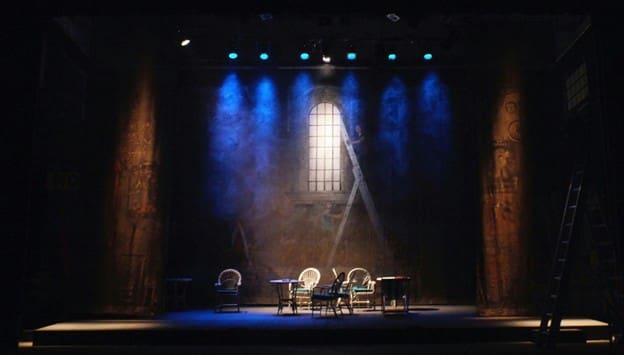
A color never exists on stage or on screen by itself. Lighting determines how every surface appears and how the audience experiences the overall mood. The same wall can feel warm and welcoming under soft amber lighting or distant and unsettling beneath cool blue illumination.
Because of this relationship, set designers and lighting designers work closely together from the earliest planning stages. Materials, textures, and finishes are selected with illumination in mind. Matte surfaces absorb light differently from glossy finishes, while patterned walls create different visual effects depending on the direction and intensity of the lighting.
Modern productions frequently adjust lighting throughout a performance to support changing emotions without rebuilding the set. A familiar location may appear comforting during one scene and intimidating during another simply because the lighting and surrounding colors have shifted.
This flexibility allows productions to create emotional variety while working within a consistent physical environment.
Audiences Often Feel Color Before They Notice It
Most viewers never leave a performance discussing the specific shade of a wall or backdrop. Instead, they remember how a scene made them feel. That emotional response is often shaped by dozens of visual decisions working together, with color playing an important supporting role. Warm palettes can create intimacy or celebration, while cooler and darker combinations may encourage reflection, distance, or suspense.
The strongest productions avoid using color as an obvious signal. Instead, designers build gradual visual relationships that evolve alongside the story. A subtle change in the background may reinforce an emotional turning point more effectively than a dramatic visual transformation that distracts from the performers.
Because audiences process color almost instantly, these choices help establish the atmosphere before dialogue has fully developed the narrative. Good set design quietly prepares viewers for what they are about to experience.
Strong Set Design Serves the Story Rather Than Competing With It
Beautiful scenery alone does not create memorable theatre or film. Successful set design supports the narrative by giving performers an environment that strengthens character, mood, and pacing. Every visual decision should help the audience remain engaged with the story instead of drawing unnecessary attention to the design itself.
Color works best when it feels intentional but unobtrusive. A carefully chosen palette can make emotional transitions smoother, strengthen dramatic moments, and give a production a distinctive visual identity without overwhelming the performance. Even simple sets become more expressive when color, lighting, and texture work together toward the same artistic goal.
That balance is what separates decoration from storytelling. Audiences may never consciously analyze the colors surrounding a scene, but they often remember how those scenes made them feel. In many productions, that emotional connection begins with the quiet decisions made by the set designer long before the curtain rises or the camera starts rolling.
